![]() Again, using R and the tidyverse packages for analysis, modelling and data visualization.
Again, using R and the tidyverse packages for analysis, modelling and data visualization.
The COVID-19 pandemic has challenged science and society to an unprecedented degree. The response also depends critically on data, focusing on analysis for a better support decision making.
In this Post, I’m exploring the relationship betwween the total Covid_19 Deaths in each country and some specific indicators of the country, like:
- Number of medicians per 1,000 cityzens
- GPD (in current $)
- Life Expectancy
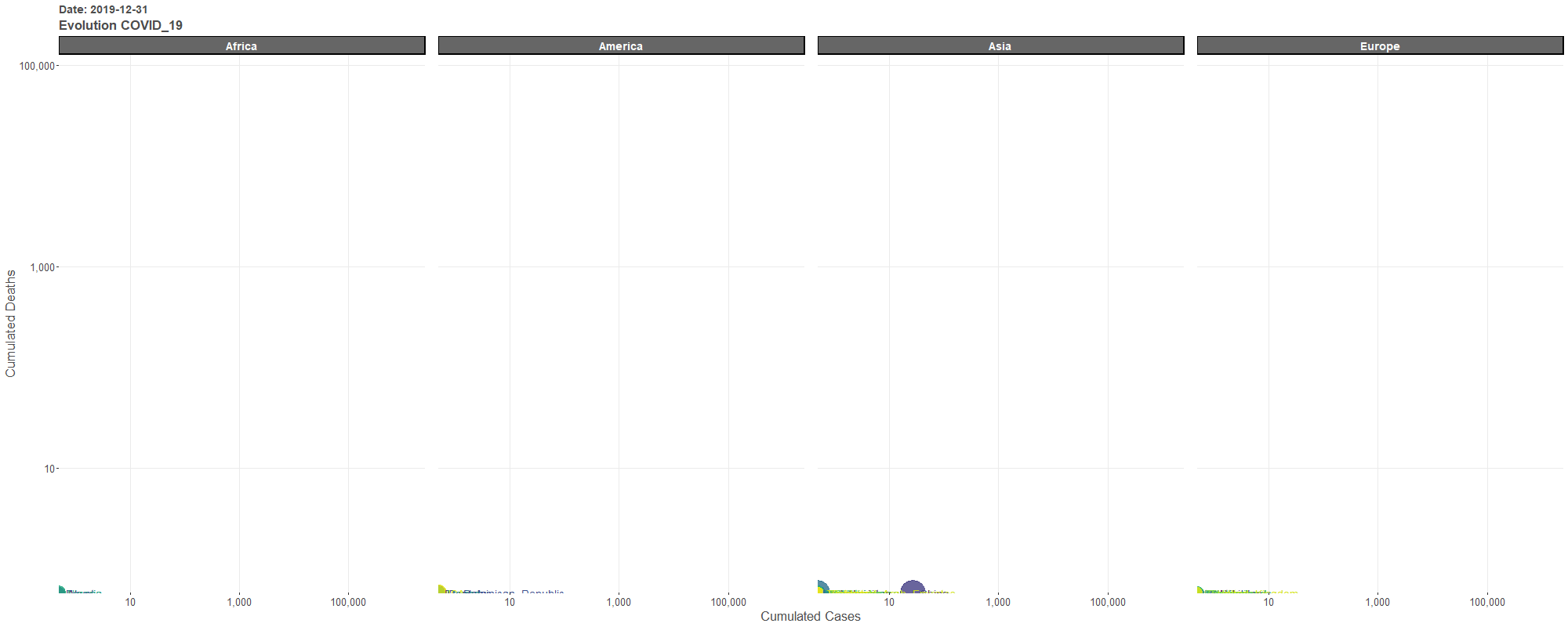
Part 1: First of all, let’s see the Covid_19 Deaths evolution (day by day) comparing all Countries:
The gganimate library is an useful tool for animated plots. One can clearly see where Covid_19 apeears first and the transmition speed along time all over the World. You can find the Day in the top left corner. All figures are from the World Health Organization. About the plot:
- x axis: cumulated Covid_19 Cases (logaritmic scale)
- y axis: cumulated Covid_19 Deaths (logaritmic scale)
- size: country population 2018
- using facet_wrap from ggplot2 to create a plot for each continent (not showing Oceania)

Covid_19 Deaths & Cases Evolution by Country: Click for a best visualitzation
Part 2: Exploring if there is some type of relationship between Covid_19 Deaths (per 1 million people) in each Country and some indicators about the country:
The first one: Medicians per 1,000 cityzens. More Medicians more Deaths??
 Covid_19 Deaths & Medicians: Click for an interactive visualization
Second one: GPD per capita (in current $). More GPD more Deaths??
 Covid_19 Deaths & GPD: Click for an interactive visualization
The last one: Life Expectancy. This seems to be the main reason, rich countries have many more older people and that’s why they have more deaths.
 Covid_19 Deaths & Life Expectancy: Click for an interactive visualization
R code to make the plot:
data_mundial_LE <- as_tibble(data_mundial) %>%
  na.omit() %>%
  group_by(continentExp, countriesAndTerritories) %>%
  summarise(Life_Expectancy=round(mean(Life_Expectancy),2),
            Pop_2018=mean(popData2018),
            Total_Deaths_x_million=round(sum(deaths)*1000000/Pop_2018),2)

p_mundial_LE <- ggplot(data_mundial_LE, aes(y = Total_Deaths_x_million, x=Life_Expectancy, colour=countriesAndTerritories)) +
  geom_point(aes(size = Pop_2018), alpha = 0.8, show.legend = FALSE) +
  scale_size(range = c(3, 13)) +
  geom_text(aes(label=countriesAndTerritories), size=3, hjust=-.5, show.legend = FALSE) +
  scale_x_continuous(labels=comma_format()) +
  scale_y_log10(labels=comma_format()) +
  facet_grid(~continentExp, scales = "free") +
  scale_colour_viridis_d() +
  labs(x = "", y = "") +
  geom_smooth(method = "lm", col="red", se=FALSE) +
  theme(panel.border=element_rect(color="gray60", fill = NA, size = .5), legend.position="none", panel.spacing.x = unit(.25, "lines"), strip.background=element_rect(colour="gray60", fill="gray70", size=1,linetype="solid"), strip.text=element_text(face="bold", size=14, colour="white"), plot.title=element_text(face="bold",colour="gray30",size=14), plot.subtitle=element_text(face="bold",colour="gray30",size=17), axis.text.y=element_text(colour="gray30",size=11), axis.text.x=element_text(colour="gray30",size=11),  axis.title=element_text(colour="gray30",size=13), panel.background=element_rect(fill="white"), panel.grid.major=element_line(colour="gray92"))