
At ERSM Re (ERSM), I’m doing a lot of reinsurance consulting work in R. Here you can see some examples of the projects developed.
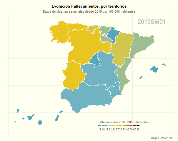
gganimate package
This package make your ggplot visualizations animated in just a few lines of code…
It’s an easy way to create an animated plot in R. In this example, the gif shows the Death weekly evolution from 2019 till now, for the different resgions in Spain. Pay attention to the weeks 13,14 and 15 of 2020; when Covid_19 caught all us completely unawares.
Nice tool for an easy ranking visualization:
Video: treemap using plotly package…
In this plot, we can see the cumulated number of Covid_19 deaths at May, 7th. Use plotly package for great interactive visualizations, in this case, set argument type to “treemap” and enjoy a very intuitive presentation…
plot_ly(data = plot_df,
        type = "treemap",
        values = ~total_deaths,
        parents = ~parents,
        labels = ~countriesAndTerritories,
        domain = list(column=0),
        textinfo = "label+value+percent parent") %>% layout(title=list(text="Covid_19 Pandemic", x=0.06))
Animated plot visualization:
Video: Animate plot using ggplot2 and gganimate packages…
Easy way to create an animated plot in R. Use gganimate package to animate your ggplot visualizations, in this case, just with 2 lines of code…
p <- data_1 %>%
  ggplot(aes(x=Date,y=Balance, group=1)) +
  geom_line(size=1, aes(color=Direction)) +
  scale_fill_manual(values=c("red","green","white")) +
  scale_color_manual(values=c("red","green","orange")) +
  scale_y_continuous(labels=scales::comma_format()) +
  labs(title="How Balance changes along time?",
       subtitle = "Currency: Euros") +
  theme_minimal() +
  theme(legend.position="none", axis.title=element_text(size=18),
        plot.title=element_text(size=22), axis.text=element_text(size=15)) +
  geom_area(alpha=.25)

p <- p +
  geom_point(aes(fill=Big_Move, group=seq_along(Date)),shape=21, size=4, color="gray50") +
  geom_text(label=data_1$Label, vjust=-1, aes(group=seq_along(data_1$Label))) +
  transition_reveal(Date)

animate(p, fps=1, height=600, width=1100)
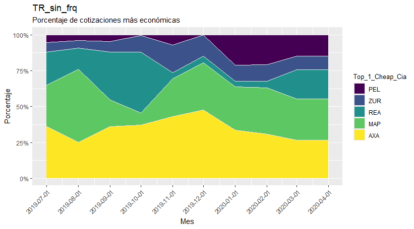
geom_area() from ggplot2:
Using an area plot to study evolution along time…
With the purrr package one can make n plots at the same time with data coming from a list with n elements.
From ggplot2, geom_area is great to compare positions along time. In this case, I’m plotting the percentage of quotes that an insurance company is the cheapest along time; and I’m plotting at the same time as many plots as types of covers, with the map function from purrr.
# plot <- purrr::map2(data_4$data, data_4$Cobertura, .f = function(x,y) { data.frame(x) %>%
    dplyr::count(Fecha_Estudio, Top_1_Cheap_Cia) %>%
    tidyr::complete(Fecha_Estudio, Top_1_Cheap_Cia, fill=list(n=0) ) %>%
    dplyr::left_join(data.frame(x) %>% group_by(Fecha_Estudio) %>% dplyr::count(Fecha_Estudio, name="total_mes"), by="Fecha_Estudio") %>%
    dplyr::mutate(percent=n/total_mes) %>%
    ggplot2::ggplot(aes(Fecha_Estudio, percent, fill=Top_1_Cheap_Cia)) +
    ggplot2::geom_area(color="gray90") +
    scale_fill_viridis(discrete=TRUE) +
    ggplot2::labs(title=y, x="Mes", y="Porcentaje", subtitle="Porcentaje de cotizaciones más económicas") +
    ggplot2::scale_y_continuous(labels=percent_format()) +
    ggplot2::scale_x_date(breaks = unique(data_3$Fecha_Estudio)) +
    ggplot2::theme(axis.text.x=element_text(colour="gray30",size=9,angle=45, hjust=1)) })

# egg::ggarrange(plots=list(plot[[1]]), ncol=1)
The result is a clear data visualization in a few lines of code, using the tidyverse packages!!
3D Analysis:
Working with data visualization in 3D…
Building a 3D graphic using R and the rgl package. RGL is a 3D graphics package that produces a real-time interactive 3D plot. It allows to interactively rotate, zoom the graphics and select regions.


Using Plotly in R:
Interactive charts…
The Plotly package is one of the best R tools to create beautiful and interactive data visualizations. Plotly’s R package is very useful to make interactive heatmaps, geographic map visualizations, and sliders. And it’s very easy to turn static ggplot2 visualizations into interactive Plotly visualizations with just one line of code. Here, some examples:


Spatial Analysis:
Leaflet package for map data visualization…
Leaflet package lets you create interactive maps right from the R console. It provides a simple and fast way to host interactive maps online in R, requiring only a few lines of code for a basic web map. Interactive panning and zooming allows for an explorative view on your pinpointed location and it has therefore a great integration in a workflow with Shiny.


Heat Maps:
ggplot2 package for data visualization…
A heatmap is a literal way of visualizing a table of numbers, where you substitute the numbers with colored cells. So, it is basically a table that has colors in place of numbers. Colors correspond to the level of the measurement. It’s very useful for finding highs and lows and sometimes, patterns.
In this example, it shows the expected XL Premium of a Reinsurance Treaty, depending on Priority and Capacity.

Another example, with frequency of use by Product, Sex and Age - Health Insurance.

Visual Results with gauge() function:
Nice and easy way to visualize your results in a Shiny App…
flexdashboard package provides this function to easily compare reactive results. A gauge displays a numeric value on a meter that runs between specified minimum and maximum values. Only allows custom colored sectors (e.g. “success”, “warning”, “danger”). By default all values are colored using the “success” theme color.
Function used:
gauge(round(table_AA()$Por_Rtdo_Reas_1[1],2), min=-5, max=20, symbol = '%', label= "Prog_Act.",
sectors = gaugeSectors(success = c(7.5, 20), warning = c(2.5, 7.5), danger = c(-5, 2.5)))

geom_polygon() from ggplot2:
Using a map plot to compare differencies between places…
I’ve also used the rgdal package to import shapefiles and used the library broom to convert shapefiles into the data frame structure I need.
# local_plot%>%
  ggplot(aes(x=long_c, y = lat_c, group = group))+
  geom_polygon(aes(fill=brks), color = "white", size = 0.1)+
  geom_path(data = canaries_line2,                # Line to separate the Canary Islands
            aes(x=long, y = lat, group = NULL),
            color = "grey40", alpha = 0.7) +
  scale_fill_manual(                              # Adding the color palette and setting how I want the scale to look like
    values = rev(pal),                            # I use rev so that red is for lowest values
    breaks = rev(brks_scale),
    name = "Renta media",
    drop = FALSE,
    labels = labels_scale,
    guide = guide_legend(direction = "horizontal",
                         keyheight = unit(2, units = "mm"),
                         keywidth = unit(50 / length(labels), units = "mm"),
                         title.position = 'top',
                         title.hjust = 0.5,
                         label.hjust = 1,
                         nrow = 1,
                         byrow = T,
                         reverse = T,
                         label.position = "bottom"))+
  labs(title="La brecha territorial en Espana",
       subtitle="Renta relativa por municipio con respecto a la renta media nacional, 2016",
       caption = "Ariane Aumaitre - Datos: INE")+
  theme_ari_maps() +
  ggsave("local.png", height = 5, width = 6)
The result is a clear data visualization in a few lines of code, using to prepare data the tidyverse packages.
